
Introduction to 2024 Web Design Trends
As we step into 2024, the realm of web design is poised to undergo significant transformation. Staying abreast of these evolving trends is not just recommended but essential for maintaining an engaging and user-friendly website. This year, a harmonious blend of aesthetics and functionality is expected to take center stage, ensuring that websites are not only visually appealing but also highly efficient in their performance.
The Importance of Keeping Up
The importance of keeping up with the latest web design trends cannot be overstated. Not only does it help in creating a compelling first impression, but it also plays a crucial role in user retention. Visitors tend to stay longer on websites that are easy to navigate, visually pleasing, and provide seamless interactions. As the digital landscape continues to evolve, it is imperative for web designers to adapt and innovate continuously.
Personalized User Experiences
One of the most notable shifts in 2024 is the growing emphasis on personalized user experiences. This involves the use of advanced technologies such as artificial intelligence and machine learning to tailor content and interactions according to individual preferences. Additionally, the integration of immersive elements like virtual reality (VR) and augmented reality (AR) is set to redefine user engagement, offering more interactive and captivating experiences.
Minimalistic Design Principles
Moreover, minimalistic design principles are seeing a resurgence, focusing on simplicity and clarity. The use of clean lines, ample white space, and intuitive navigation aids in enhancing the overall user experience. At the same time, sustainable web design practices are becoming a priority, with designers opting for energy-efficient solutions and environmentally friendly hosting services.
In essence, the web design trends of 2024 are geared towards creating a more inclusive, efficient, and visually striking digital space. By embracing these trends, businesses can ensure that their online presence remains relevant, competitive, and capable of meeting the ever-evolving expectations of users.
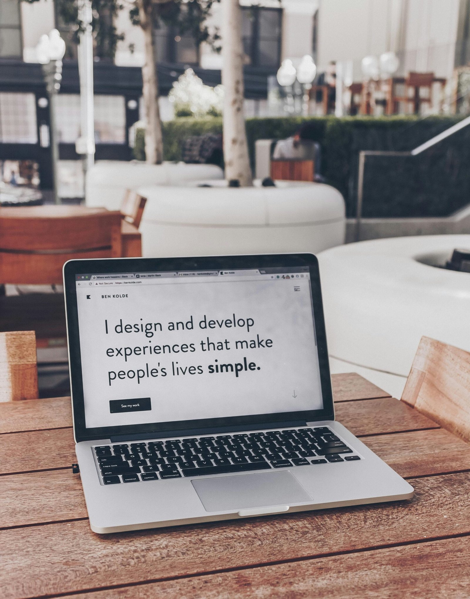
Minimalism
As we move into 2024, the trend of minimalism in web design shows no signs of waning. Originally gaining traction for its simplicity and clarity, minimalism enhances user experience by stripping away unnecessary elements and focusing on what truly matters.
Characteristics of Minimalism
This approach is characterized by clean lines, abundant white space, and a reduction in visual clutter, creating a streamlined interface that makes navigation intuitive and content easy to consume.
Benefits of Minimalism
The benefits of minimalism are manifold. For users, a minimalist design reduces distractions, allowing them to engage more deeply with the site’s core content without the noise of superfluous elements. This is particularly advantageous on mobile devices, where screen real estate is limited. Simplified navigation and faster load times are additional perks, improving overall usability and performance.
Successful implementations of minimalistic web design can be seen in websites like Apple and Runway. These sites effectively use white space and focus on high-quality visuals and concise text, enhancing user engagement and retaining focus on key aspects of their offerings.
Business Advantages
For businesses, adopting a minimalist design approach can lead to increased retention and conversion rates. A clear, uncluttered interface often translates to higher readability and better accessibility, ensuring that users find what they are looking for quickly and effortlessly. Minimalism also lends a modern, professional appearance to the website, which can be pivotal in establishing brand credibility and trust.
In essence, minimalism transcends mere aesthetic appeal. Its utility in improving user experience, optimizing performance, and fostering a credible brand image underlines its enduring relevance in the web design landscape of 2024 and beyond.
Mobile-First Design
As the number of users accessing the internet via smartphones continues to surge, the emphasis on mobile-first design has never been more pronounced. In 2024, web designers and developers must prioritize mobile-first principles to ensure optimal user experiences on smaller devices before scaling up for larger screens.
Core Philosophy of Mobile-First Design
At the core of mobile-first design is the philosophy of designing for the smallest screen and then progressively enhancing the user experience as the screen size increases. This approach ensures that essential content and functionalities are accessible and user-friendly on mobile devices, which is critical given that more than 55% of global web traffic now comes from mobile devices.
Principles of Mobile-First Design
Several principles guide mobile-first design. Firstly, it involves a content-first strategy where designers strip back unnecessary elements to highlight key information. Streamlined navigation, touch-friendly interactions, and fast loading times are also paramount. Navigation menus often take on more compact forms, such as hamburger menus, to maintain a clean and accessible interface.
Statistics underscore the significance of mobile-first design. According to recent studies, users are five times more likely to abandon a task if a site is not mobile-optimized. Moreover, Google’s mobile-first indexing further emphasizes the importance of having a mobile-friendly site, as search rankings could be adversely affected if the mobile experience is subpar.
For web designers and developers, embracing mobile-first design is not merely about following a trend but adapting to an evolving digital landscape where mobile access dominates.
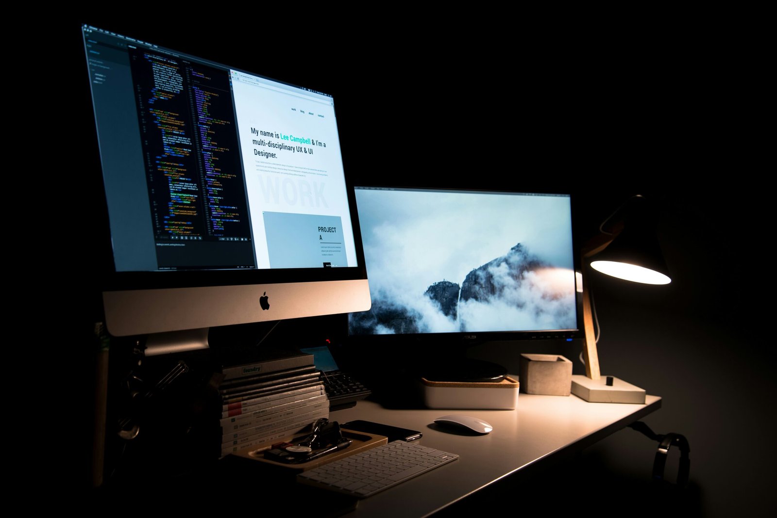
Dark Mode
In recent years, dark mode has emerged as a prominent trend in web design, owing to its numerous benefits and growing user preference. This aesthetically pleasing design choice involves the adoption of darker color palettes for user interfaces.
Benefits of Dark Mode
One of the primary advantages of dark mode is its positive impact on eye health. Many users find that darker themes are less straining on the eyes, especially in low-light environments. This is particularly beneficial for those who spend prolonged periods staring at screens, as it helps to minimize fatigue and enhance overall comfort.
Technical Implementation
From a technical perspective, implementing dark mode is relatively straightforward for developers. Most modern frameworks and libraries, such as CSS and JavaScript, offer built-in support for dark mode. Developers can utilize media queries like prefers-color-scheme to detect a user’s preference and apply appropriate styles accordingly.
User Preferences
User preferences increasingly favor dark mode, driven by the proliferation of mobile devices where conserving battery life is a critical concern. OLED screens, commonly found in smartphones, consume significantly less power when displaying darker colors.
Several noteworthy websites and apps have effectively embraced dark mode, enabling users to choose between light and dark themes based on their personal preferences.
Incorporating dark mode into web design is more than just a trend; it is a strategic decision that enhances user experience by addressing eye strain, extending battery life, and meeting user preferences.
Neumorphism
Neumorphism, a design trend expected to gain significant traction in 2024, masterfully merges elements of skeuomorphism and flat design.
Characteristics of Neumorphism
This hybrid approach is characterized by soft, 3D-like appearances that offer a visually appealing and tactile experience. At its core, neumorphism employs subtle shadows and highlights, which create lifelike depth and dimension, making web and app interfaces look more intuitive and engaging.
Advantages and Applications
Potentially, neumorphism can be particularly effective in applications where a touch of realism is required to improve user experience. Its 3D-like design can be used for buttons, cards, and switches, providing an intuitive interface that guides user interactions seamlessly.
However, despite its advantages, neumorphism does have limitations. When overused, the delicate balance required to maintain subtlety can result in excessive glare or insufficient contrast, potentially leading to accessibility issues.
Examples and Considerations
Examples of neumorphic interfaces can be found in a growing number of modern web and mobile applications striving for a unique and user-centric design.
Advanced Micro-Interactions
As web design continues to evolve, the importance of advanced micro-interactions in enhancing the user experience becomes increasingly evident.
Definition and Examples
Micro-interactions are small, almost imperceptible animations or design elements that respond to user actions in meaningful ways. A classic example of a micro-interaction is the animation that occurs when a user hovers over a button. This visual cue not only highlights the button but also provides feedback that assures the user the element is interactive.
Importance in User Experience
Advanced micro-interactions go beyond mere aesthetics; they improve the usability of a website by making it more responsive and user-friendly.
Incorporating advanced micro-interactions into web design is a trend that is set to rise in 2024.
AI & Machine Learning Integration
Artificial Intelligence (AI) and Machine Learning (ML) are revolutionizing web design, creating more personalized and responsive user experiences.
Key Features and Applications
By integrating AI into web design, developers can harness its capabilities to understand user behavior, predict preferences, and adapt content dynamically.
Challenges of Integration
However, incorporating AI and ML into web design also comes with its challenges. One primary concern is the increased complexity of implementation, as integrating AI requires advanced technical skills and resources.
Sustainable Web Design
In recent years, sustainable web design has garnered increasing attention, with businesses and developers emphasizing the importance of minimizing the environmental impact of digital products.
Principles of Sustainable Design
The principles of sustainable web design revolve around optimizing performance, reducing energy consumption, and selecting eco-friendly hosting solutions.
Practical Tips for Designers
For designers and developers aiming to embrace sustainable practices, several practical tips can be adopted. Regularly auditing the website’s energy consumption and performance can highlight areas for improvement.